This is the first post of a series of infographics I will be making related to The Cauldron. I will be searching for data to visualize to make some infographics, since I like making them a lot. If you have any suggestions, please comment below.
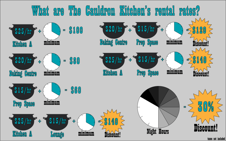
The following graphic is a practical one where I visualized our rental rates. The visual feature here is the clock, showing our minimums and our special night time hour discounts. The dawning of the day might not work visually in winter, but I think it gets the point across of the specific hours that are discounted. I will put this graphic on our front page as an easier method of understanding our rates.
Note that today at the Cauldron Deli, we are hosting Tandoori Fusion. They have a lunch menu of Butter chicken/ rice / samosa combo or veggie option chick pea curry instead of butter chicken!